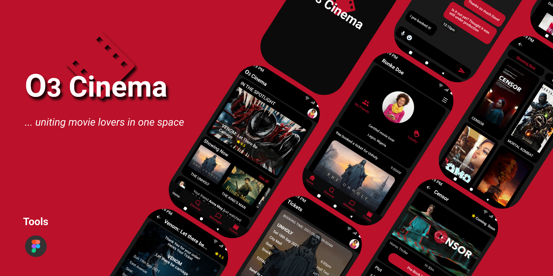
Reimagining the Post-Pandemic Movie Ticketing Experience for Cinema Lovers
- Product Design
- Product Strategy
- User Research
- Usability Testing
- Personal Project
The Background
The attempt to curb the spread of the COVID-19
virus restricted several social activites, especially visits to public places and crowded
gatherings.
However, as the management and prevention of the virus continue to improve, many parts of the world are
witnessing
the strict limits on movement being eased or lifted completely.
While this is especially exciting for fun-loving people who anticipate the possibility of resuming
their
social activities and restoring as much normalcy to their lives as possible; businesses that cater
to large crowds still
have a lot of work to do in terms of managing their post-lockdown operations to ensure it adheres to
health guidelines, protects the health of their customers, and employees, all without affecting their
profits excessively.
The Challenge
Define an intuitive post-pandemic movie ticketing experience that fosters community amongst cinema enthusiast.
My Role
- Product Designer
- Product Manager
- User Researcher
Project Duration
From Research to Hi-Fi Prototype in 14 weeks, using;
- Fig Jam
- Figma
- Testing: Maze App
Final Deliverable
I created a clickable Hi-Fi prototype that took users through a simple 8-step process of booking their ticket from the home screen to the ticket confirmation page.
My Approach
I began the process by asking questions to understand the users.
For this, I conducted research on the local cinemas in my state to determine who the customers
are and the available alternatives they currently utilize to purchase their movie tickets.
Following findings from secondary research, customer feedbacks, and personal observations
from visits to the cinema, the demography for moviegoers is largely of young adults;
mostly females, who go to the movies (particularly in groups) for the social experience,
as a means to relax, network, or make a social statement.
Finding Answers
To understand ticketing app users experience with the available alternatives,
I visited the websites of major cinemas in the city and downloaded the only available movie
ticketing app at the moment.
Getting to experience the alternatives allowed me understand some of the pain points
experienced by customers as they tried to book thier tickets using these available methods.
With the help of the "How might we approach", I was able to
find ideas that allowed me align user pain point with goals.
The major pain point users experienced were:
- "The app is only setup for club memeberships....just pay for your ticket when you visit the cinema in-person."
- "It is confusing to move around... been trying to get ticket for 2 days."
Considering this, how might we... "create a remote experience for users that allows them reach their goals easily?"
Considering this, how might we... "enable users to use their mobile devices to obtain the most crucial information?


User Personas
Paper, Wireframes & Mockups
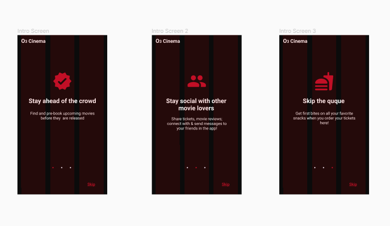
Taking the user pain points as a guide, I devised an eight-step method to ticket purchasing with the aim of achieving an experience that is both focused and simple. The design drafts focuses on enabling the target users achieve their goals of booking and paying for their tickets in no more than eight steps - from the home screen to the ticket confirmation page.


Eight Steps To Ticket Booking


Wireframe, Early Designs and Prototype
Usability Tests
With the wireframes and its prototypes, I conducted the first round of unmoderated usablity
tests through Maze app. With a total of 14 participants and 12 successful responses, I
recieved valuable
feedback that served as pointers into what the target users would love to have.
The test focused on 3 major aspects of the experience:
- How easy is it for users to navigate the app
- How easy is it for users to achieve their goal on the app
- Users overall experience booking a ticket in the app
The first usability test was successful as it revealed several points for improvements as well as a need to pay more attention to potential accessibility needs of diverse users.


User responses from the first usability test: Wireframe & Prototype
On Accessibility
- 1 out of 14 participants is color blind.
- 3 out of 14 participants needs glasses to see properly
This meant that cues for call to action couldn't rely on the use of colors alone.
This emphasized a great need for distinct contrast between UI elements and background, as well as clearer call to action cues for easy readabilty for all users especially those that are visually impaired


Before and After re-iterations on the UI and Userflow

Design Assets and First Screens